
Why Your App Optimization might be Lacking without UX App Analytics
If you have an app, you probably have an app analytics system or at least considering one (or maybe even multiple).
I bet that many of you are using Google Analytics, which is certainly the most used solution on the market- but there’s an important discrepancy within that well-known stat. According to the recent report by VentureBeat, Mobile App Analytics: What winning mobile developers use, only 30% of the app developers surveyed said Google Analytics is their primary analytics choice. At the end of the day, developers “use a wide range of tools to analyze and understand what is happening inside their apps, and while Google is by far the leader, it’s not the only important player in the space.”
This is partly due to the rapid specification of the needs of apps and the sheer mushrooming of the mobile app industry. Nowadays, the top app developers use distinct analysis tools for marketing automation, acquisition, engagement, A/B testing, monetization, and most notably UX.
For this piece, let’s zoom in on UX app analytics and what it can do for your app in terms of optimization.
First, what does it mean? I presume you already know what UX is. By definition, User eXperience encompasses all aspects of the end-users interaction with the company, its services, and its products. Yet to really understand the UX of your app, you need to essentially see what your users are experiencing and how they behave. This is where the power of effective UX app analytics comes into play.
Going Beyond Traditional Mobile Analytics
So I have prefaced that UX app analytics is critical to your understanding of your users and optimization of your app, but what fundamentally sets it apart from the traditional analytic systems out there? The answer: qualitative data. Traditional mobile analytics tools provide you with quantitative data and emphasize key metrics, such as the number of new users, engagement rate, user retention, and geographic breakdown. These metrics are important yet how often do you get the feeling that you have too much data and not enough insights? It’s a commonly felt sentiment. In order to truly understand the “whys” behind all the numbers, you need visualization of what’s going on inside your app. This is the fundamental goal of UX app analytics.
I’ve got a metaphor that perfectly signifies this value. Let’s say someone told you about an amazing trip that they took to the Great Barrier Reef. This act of telling you about their experience is like traditional, quantitative mobile analytics. Now say someone actually showed you pictures and videos of that reef- you are now getting visuals of their trip and can understand their experience at a much higher level. This is the essence of qualitative, UX app analytics.
UX app analytics like Appsee, empowers app teams to go a step beyond passive data and gain visual insights, allowing them to fully examine user behaviors, conversion funnels, UI updates, and new features, and ultimately streamline the app optimization process. For example, maybe a specific user pathway from an “account creation” screen to your app’s shop has an extremely high quit rate. Why is that? Traditional mobile analytics isn’t going to break things down for you in a clear-cut manner. A table of data can only take us so far, and often times there are insights we simply cannot deduct from numeric data.

User Recordings
This unique tool enables you to watch active user sessions in real-time and see exactly how users interact with your app through their eyes, plus when and where they might be encountering friction within your app. By analyzing these recordings, you are presented with information that will help you learn which problems your users encounter and why they don’t complete important processes within your app (such as in-app purchase and mobile onboarding). This is powerful because it is practically like glancing over your users’ shoulders and seeing exactly how they behave with your app. Did you detect frustration in a recorded user’s session due to your app’s navigation menu design? It would be very hard to pick up on that by looking at a list of metrics.
Take a look at the sample recording below which shows a user who cannot log in via Facebook due to a technical problem. The user attempts to log in and encounters the error pop-up message. This quick yet powerful visual can highlight why users are dropping off your valuable sign-in screen. No more guesswork- you can just click the play button and see for yourself how your users behave.
https://youtube.com/watch?v=KoVum1nuihA
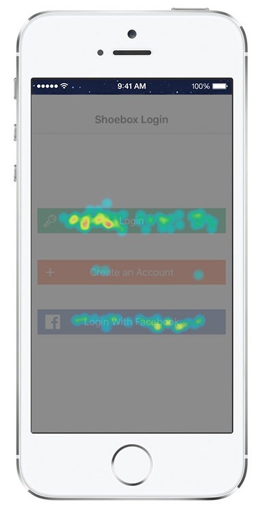
Touch Heatmaps
While user recordings are more focused on the single user level, touch heatmaps can help provide an aggregate, full picture regarding your users’ behavior. Touch heatmaps assemble all user gestures (taps, swipes, pinches, etc.), allowing you to see where your users are focusing their attention the most, and help you gain an understanding of the efficacy of your app’s UI. They can also help you detect unresponsive gestures on each screen, which if gone unnoticed, can essentially make or break your user experience. Unresponsive gestures can signify a bug or they can illuminate a design flaw within your UI.
Take a look at the heatmap below. From this crisp visualization, you may come to the conclusion that a call to action (CTA) button needs to be moved a few pixels up, or one of the features (‘Create an Account’) is simply being ignored/less preferred by your users. At the end of the day, this qualitative data can help you understand a number of gestures and design KPIs and their implications, and how you can ultimately improve your UI design.
Wrap-Up
Although I have stressed the fundamental value of qualitative data, I highly recommend that you utilize this data in conjunction with quantitative. Quantitative data can pinpoint where the trouble areas of your app lie. Once noting those troublesome sections, you can then harness the qualitative benefits of visual, UX app analytics to help you find the exact reason(s) for the trouble. Don’t forget that in order to fully understand your user experience, you must actually see for yourself how your users are behaving. Without those insights, your UX will likely fall short. At the end of the day, traditional analytics should not be your be-all-end-all solution for app optimization.


Thank you for your interest!
Our team will get in touch with you shortly.