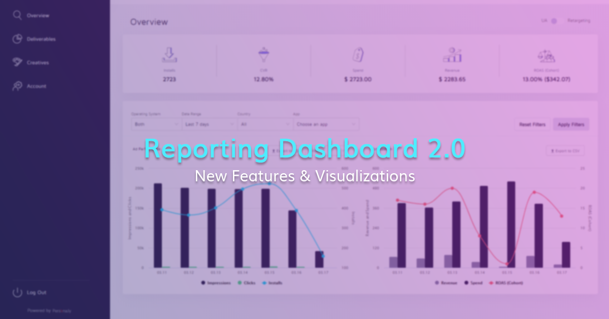
Reporting Dashboard 2.0 – New Features
Along with the regular e-mail update we send out to our partnered advertisers whenever we release new features on the dashboard, I stopped for a second to try to figure out why we never really posted about the dashboard in our blog.
Dashboard? What Dashboard?
Come to think of it, since I mostly work on features that can’t really be practically used by our partners (while I do work on ones that end-users interact with, like interactive and playable ads), I guess I was too excited and preoccupied with getting initial feedback from and interviewing our beta users during last May. I guess that’s it.
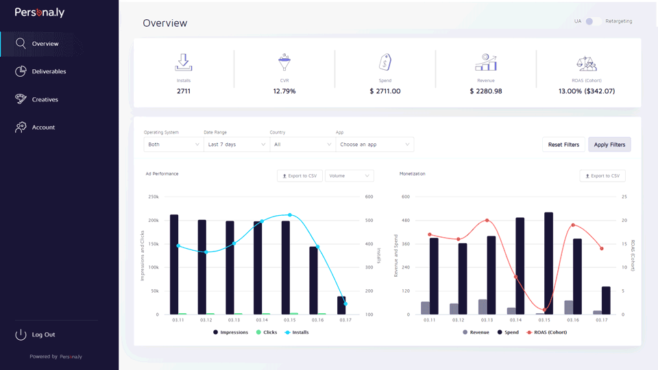
Our reporting dashboard is the practical implementation of one of our core ideals – transparency. In the dashboard, partners can see performance data for their campaigns that we run through our bidder.
As seen in the quick preview GIF below, it currently includes three sections:
- Overview – a bird’s-eye view of all promoted bundles in all GEOs, showing general performance metrics as well as ROAS.
- Deliverables – a drill-down for each promoted bundle, allowing the partner to see the spend and performance metrics per placement bundle, including post-install events and FTD costs.
- Creatives – same idea as deliverables, with the same exact data displayed at the creative level.
The New Features
The 2.0 is there for good reason, this isn’t a release log entry that just says ‘Bug fixes’ like those lazy app store updates (I’m looking at you, release managers). Let’s start with the coolest one:
The Effective Cost Graph
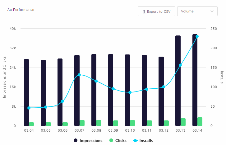
We added this graph to the ‘Ad Performance’ section of the overview to allow our partnered UA managers a metric that matters a lot, at least for the early stages of new campaigns.
The graph allows users to see the cost per install and the number of installs per day, making the process of detecting cost-related trends much more intuitive.
In a future release, we will allow users to choose what event other than install to track in this same graph, which is a natural need when the campaigns are more mature and we’re optimizing towards events deeper in the funnel.
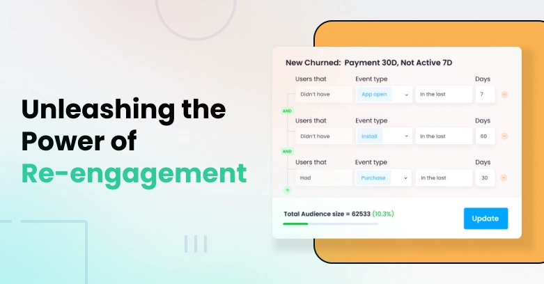
The Retargeting Toggle
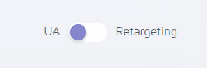
This one is pretty straight-forward and, honestly, it was just missing. We used to have to create two separate logins for partners to review UA data on one and retargeting data on the other (sorry, partners!).
Now, users can easily switch the toggle on any screen in the system and only the relevant data will be shown.
Language & Timezone Selection

Due to popular demand, we finally localized the dashboard to 4 additional languages – Chinese, Japanese, Korean and Russian.
In a future release, we will add another localization feature allowing users to change the timezone for the report. Initially, we are only adding JST and KST local time, as most of the other GEOs align with UTC.
Improved Filter Control

We’ve added the ability to reset or apply filters. I know it’s not that it might not be that exciting, but this feature is a huge win-win for us. Users get more convenience, and we make fewer calls to the backend. That’s what I call a double whammy.
What’s Next? Pie Graphs?
NO! We hate pies! Seriously though, the next releases are going to focus on showing our partners more detailed insights into what drives the decision making done by our machine learning models as well as visualizations to support it.
That’s it for now, stay tuned for more release notes in the near future!


Thank you for your interest!
Our team will get in touch with you shortly.