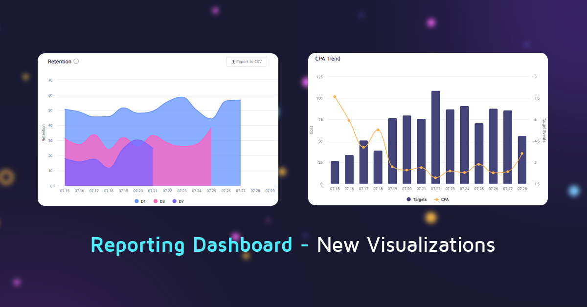
Reporting Dashboard – Improved Campaign Data Visualizations
As part of our commitment to transparency and providing value to our partners, we make sure to get their feedback on our performance, communication & reporting as frequently as possible.
This feedback is invaluable for product teams, since no matter how confident you are when making design decisions or how hard you try to convince yourself you know better, the client; the user himself – knows best.
A good dashboard for anything ad-tech-related needs to bring attention to what matters most – costs, performance vs. the defined KPIs, as well as noticing their trends, especially sudden shifts like hockey-stick growth or god forbid anything indicating that something broke in production (don’t worry, we have tons of alerts in place for that!).
This new iteration of our Performance Dashboard includes several additions to our ‘Overview’ tab and was designed to make the data that matters most more accessible without the need to deep dive into the deliverables.
Retention Tracking
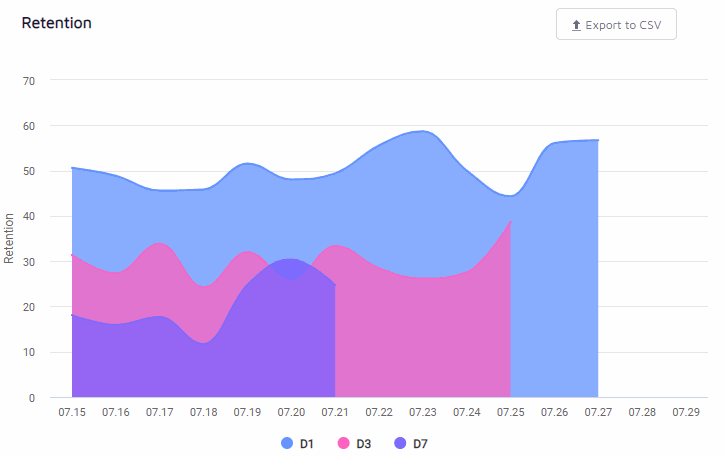
While retention only tells part of the story when it comes to performance-based UA – it’s an integral part of confirming the targeted population is indeed invested in the promoted app and engages with it at a high level.
D1 through D7 retention is a strong indicator not just for hyper-casual or anything more ad-monetization oriented, but also for IAP-based games, as we regularly see higher D7 retention correlates with higher IAP/ARPPU values.
The Retention Tracking graph allows you to see retention values for each promoted app in daily cohorts and includes data only for those with fully matured data.
The graph includes D1, D3, and D7 retention and doesn’t include the more later D14/D30 to avoid visual overcrowding, but those are of course still available in our ‘Deliverables’ tab.
CPA Trend Tracking
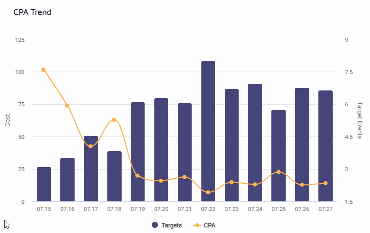
CPA goals are paramount in their importance and our machine-learning driven bidder is designed to drive costs down as much as possible all the while maintaining or exceeding ROAS and scale goals.
The CPA trend graph allows our partners to view their CPA in daily cohorts, for any target that they define, whether it’s an FTD, a trial registration, or completing an in-game tutorial.
Effective Cost Shown by Default

While the effective cost graph which tracks CPI and installs volume isn’t new, it was hidden behind a dropdown which made it two clicks away from sight.
CPI, in very similar to retention in that it doesn’t tell the whole story but is integral to it, so we decided to include it in the forefront, to allow our partners a quicker holistic view of how campaigns are performing.
Now our partners can easily get a snapshot of all of their campaign performance metrics, including everything from impression volume to the cost per paying user in a single browser tab.
And of course, they are always invited to dive deeper into the Deliverables or Creatives tabs to see publisher or creative level data.
What’s Next?
We’re already planning future iterations which are going to include deeper insights into the decisions made by our custom predictive models and which features are most important for distinguishing between and acquiring engaged users for our partners’ apps, so stay tuned!


Thank you for your interest!
Our team will get in touch with you shortly.