New Dashboard Features: User Acquisition Creatives Performance at Your Fingertips
As a UA manager, you can’t underestimate the importance of the creative materials you use to promote your app. In this blog post we’ll describe the different ways our dashboard can help you decide which creatives have the most impact.
Regardless of the level of creative selection/optimization of the platform the UA campaigns are running, a UA manager would always like to make sure that the budget is spent properly among the different ads, that the “champions” get most of the allocations, and you are not showing the wrong creatives to the wrong audience. Regular review of the creatives’ metrics helps you make sure that you utilize the full power of the platform/inventory you are working with.
Before we will get to the details of the metrics available for creatives on our dashboard, here is the basic structure of the Persona.ly dashboard. It is comprised of 3 main tabs:
- Overview – a bird’s-eye view of each promoted app in all GEOs, showing general performance metrics as well as ROAS.
- Deliverables – a drill-down for each promoted app, allowing the partner to see the spend and performance metrics per placement (i.e. publisher), including post-install events, FTD/CPA costs, retention, etc.
- Creatives – the tab provides the same granularity of data provided for placements at the creatives’ level.
Let’s take a deeper look at the Creatives tab.
Under the “Creatives” section you will find all the information about your creatives’ performance: Clicks, Installs, CTR, CVR, and, in fact, most of the deep-funnel metrics you need to be aware of. Displaying which creative assets perform better and which are selected by our creative selection algorithms is an important part of our transparent approach to UA, and while creatives are selected automatically (as detailed below), it does enable our clients to make data-driven decisions on which creatives to use more often (and in which scenarios) on other platforms.
Let’s take a look at a few use case scenarios.
What Are The Most Engaging Creatives?
In-app ads offer an engaging user experience by using videos, playable ads, native ads, dynamic content ads, etc.
Our ML-driven model is adjusted to promote best-performing creatives based on a Multi-Armed Bandit (MAB) algorithm. Compared to the standard A/B testing method, MAB offers an alternative and more intricate way to test creatives: the test is ongoing, operating continuously throughout the campaign. As learning of the MAB algorithm progresses, the ML model gradually transitions to the Contextual Bandits approach where different creative “champions” are displayed to different groups of users based on the group features/demographics.
You will find that our model is trained to display the most performing creatives to achieve the highest IPMs (Installs per Mille) and reach deep-funnel targets – the data reflects who the champion creative is for each format, as that champion gets the majority of impressions while the others are being rotated, competing to beat it.

Which creatives bring the most value?
While this task is seemingly easy to complete, you want to consider not just the absolute number of installs (which obviously matters), the IPM, or the resulting eCPI, but the ROAS for each creative.
The 3 main types of in-app creative types (interstitial ads, native ads, and banner ads) differ in many aspects. While some formats may generate significantly higher ad engagement and IPM, you might find that other creative types are actually the ones that bring higher ROAS.
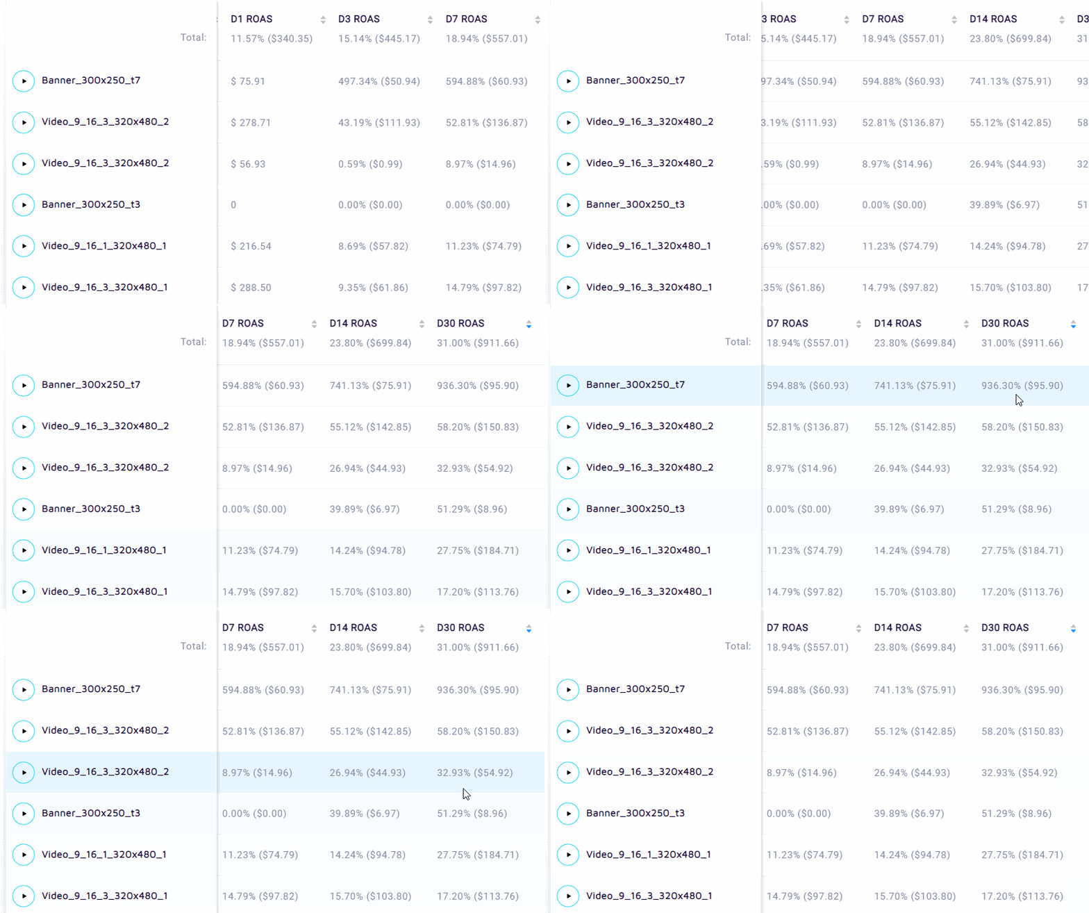
Now, as we have discussed the key features of the Creatives tab, here are the newly developed features of the tab that provide even more granular data.
Creative Combinations
Creatives Granularity
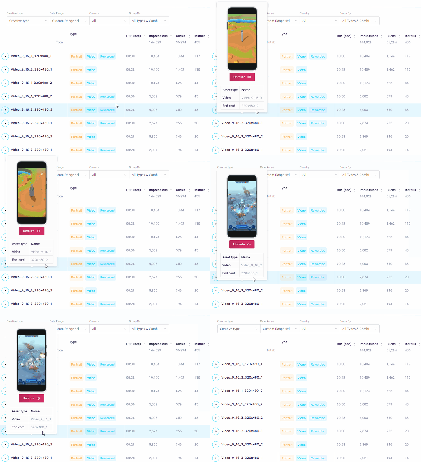
When developing a product roadmap, we focused on which features will be most valuable and will provide a level of detail that will benefit and inform our partnered advertisers. In most cases, due to the lack of capability of considering each unique combination separately, each item type comprising of a creative template (in videos – the video itself and the end card, in native ads – the image, the title, etc.) gets a champion crowned, but beneath the surface, a specific combination can be the actual reigning champion. That’s why we developed the feature that enables our clients to see the performance of each unique creative combination.
Video and End Card Combinations
This view, available for video creative types, allows seeing which video and end cards combination outperforms the rest.
Native
For the Native ad format when the image, title, content and CTA button are combined, we generate a table that displays how well each combination performs while also providing a preview of how that combination would render on an end-user’s device.
Creative Preview
In the revamped preview feature, we display the final rendering of the creative as it’s done on the end-user’s side.
What’s Upcoming?
Our partnered advertisers are already making use of the proprietary feature developed for SKAN / post-iOS 14.5 campaigns. The algorithm measures the performance of campaigns running on the SKAdNetwork and uses probabilistic attribution to display granular reports – to help advertisers better understand their acquisition tactics and allow them to adjust the strategy accordingly.
